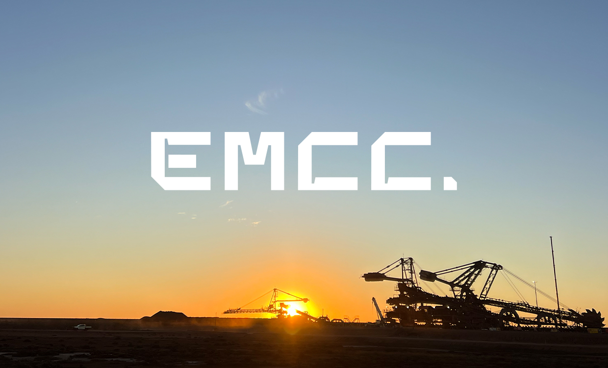
Niall came to me in 2024 with his new business Engineering Management Costing Consultants (EMCC) a labour hire, project management and engineering services company, operating across Australia's mining and industrial sector. He briefed me to build a brand that would stand out in an industry 'full of old blokes’. I used his younger team, leaning more towards 25-35, as the foundation of my thinking going forward.
I led this project, managing another designer. I wanted to build a brand with genuine bold energy that fits in the sector; a brand that would age well as the company grew into itself. Rather than lean on the visual language of mining and engineering, the identity was built around who EMCC is rather than what it does. Digging deeper, I discovered a courageous, disciplined and most importantly competent and tenacious business. To reflect these values, we came up with a custom lettermark, one with sharp points and clipped edges, with each character drawn to the same square proportion. The end result an analytical precise mark, that doesn’t note to one industry or discipline.
The colour palette took its cue from the one piece of visual language that does belong on site — hi-vis. The primary green, Gaspeite, is highly saturated and named after a mineral found across Australia. It’s paired with Obsidian Black and Chalk White for added punch. Field Gothic — rooted in old Unimark subway signage — handles headings and carries on the aesthetic started with the EMCC’s custom lettermark. The "C" from the lettermark became a recurring device throughout, its bevelled edge lending itself to cropped compositions, framed imagery, and flexible layouts across the website, digital banners, OOH, and applications for vehicles, PPE, and stationery.